Photo Credit: Original image by Ricochet64 via stock.adobe.com modified by Colin Finkle.
The bull is reborn in Lamborghini’s logo, shedding its golden armor for a refined two-color silhouette.
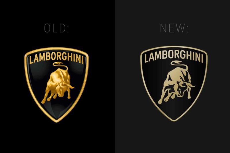
On March 28, 2024, Lamborghini announced a redesign of its traditional bull logo.

The iconic Italian luxury sports car manufacturer has updated its classic logo, characterized by the gold-sculpted bull on a black emblem. The bull logo has been synonymous with power, luxury, and speed since the company started in 1963. This rebranding is the first update of the logo in over 20 years.
The updated logo reimagines the bull with a more contemporary graphic design style.
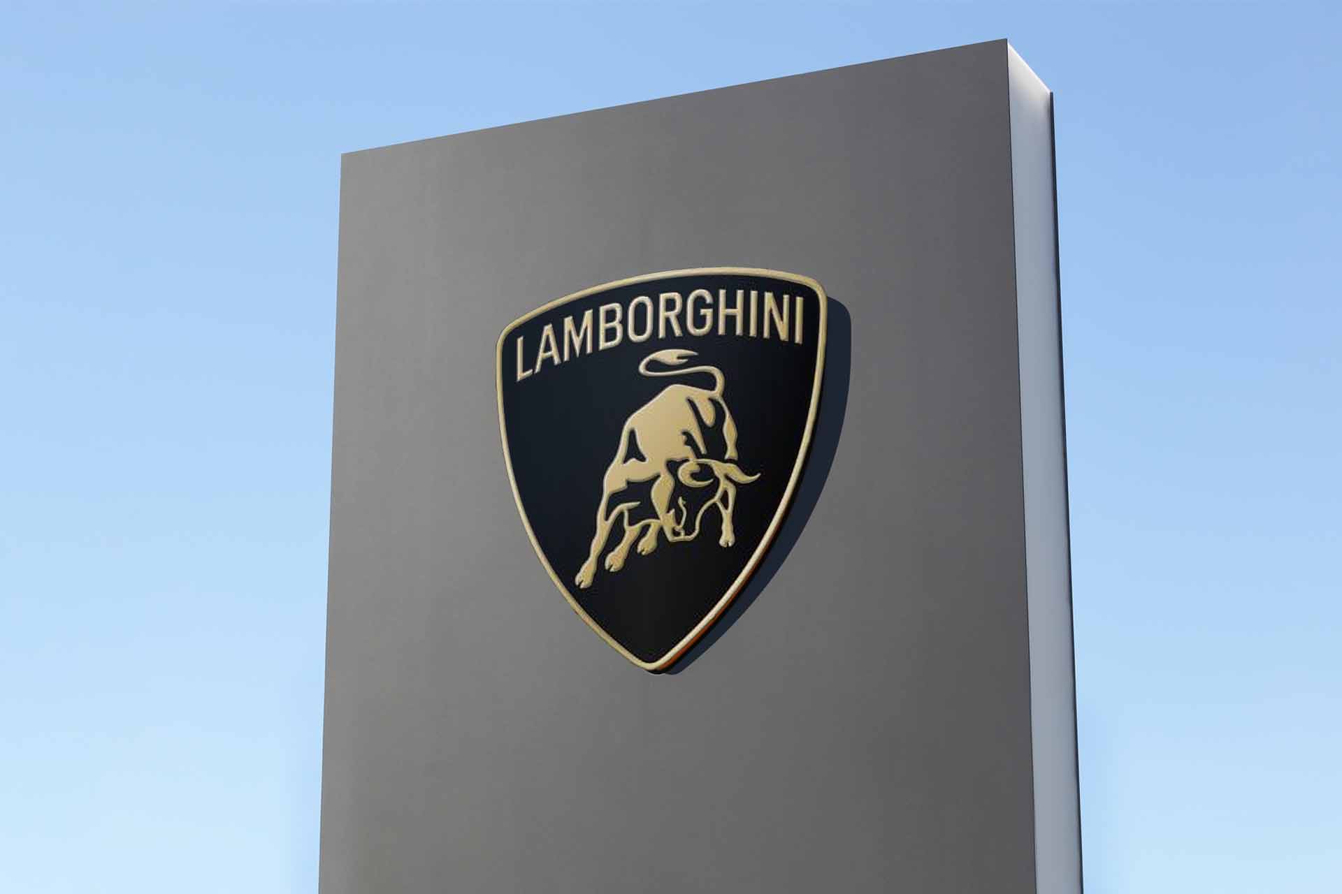
The new logo retains the familiar shield shape, and the Lamborghini name arced across the top. Still, it introduces a simplified, two-tone illustration of the bull.
This evolution is significant from the elaborate, 3D gold detailing to a sleek, minimalistic design. It embraces a modern aesthetic because Lamborghini wants people to know they are looking to the future and evolving their values and products.
Gold has yet to be entirely abandoned; specific versions of the new logo will retain a touch of gold without the sculpted, three-dimensional effect of the past.
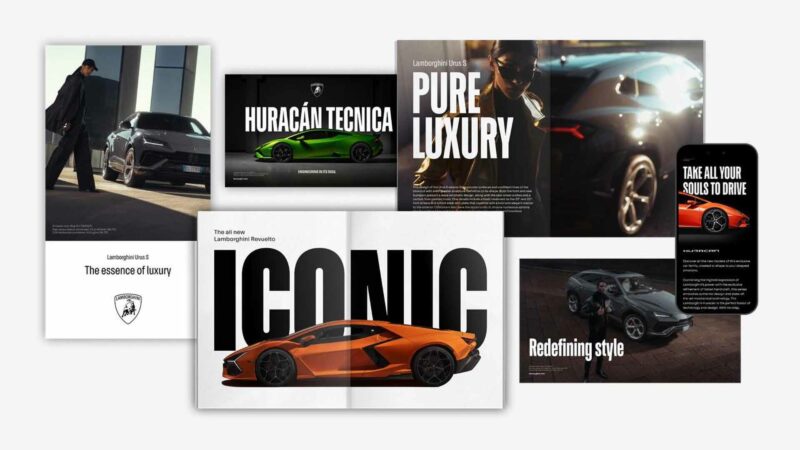
New fonts, high-contrast photography, and bold typography come with the updated logo.

The rebranding extends beyond the logo itself. The entire Lamborghini visual identity has been revamped to incorporate bold fonts and a high-contrast, black-and-white look with minimal color usage outside of photography.
The typography in the graphic design is sharp, bold, and angular to match the industrial design of the supercars and SUVs.
For the first time, the bull illustration will step outside of the shield in Lamborghini’s marketing materials.
The new brand updates Lamborghini’s look as they update their fleet to electric and hybrid powertrains.
Lamborghini’s leadership has indicated that this change is more than just a visual update; it reflects a broader shift in the company’s values towards a more environmentally friendly and technologically advanced future using electric and hybrid powertrains as we’ve seen in the new Lamborghini Revuelto.
Lamborghini is still committed to offering thrilling, engaging, and luxurious driving experiences while embracing sustainability and innovation.
Conclusion
By evolving its visual identity, Lamborghini is not just keeping pace with the times; it’s setting the pace, ensuring that it continues to captivate and inspire automotive enthusiasts around the globe.
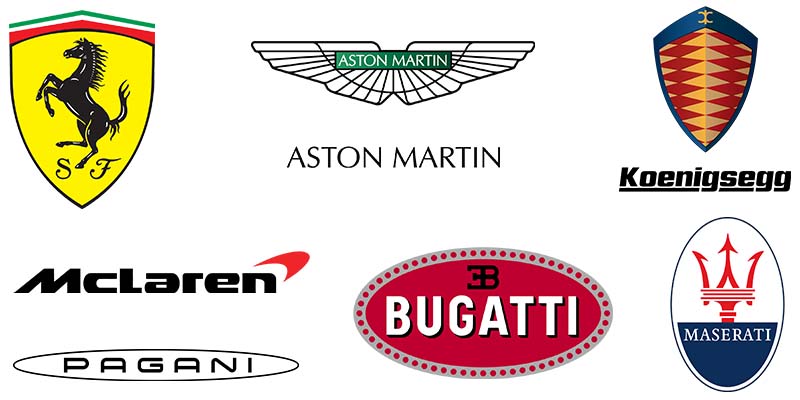
The new logo positions Lamborghini as more modern and less constrained by its history than Ferrari, Porsche, and Bugatti. As McLaren struggles with financial issues, Lamborghini is trying to be the brand for supercar buyers looking for new technology and fresh design.

Related: Lamborghini and it’s competitors.

Leave a Reply